website analysis- unit 34.
p1-analyse 2 websites.
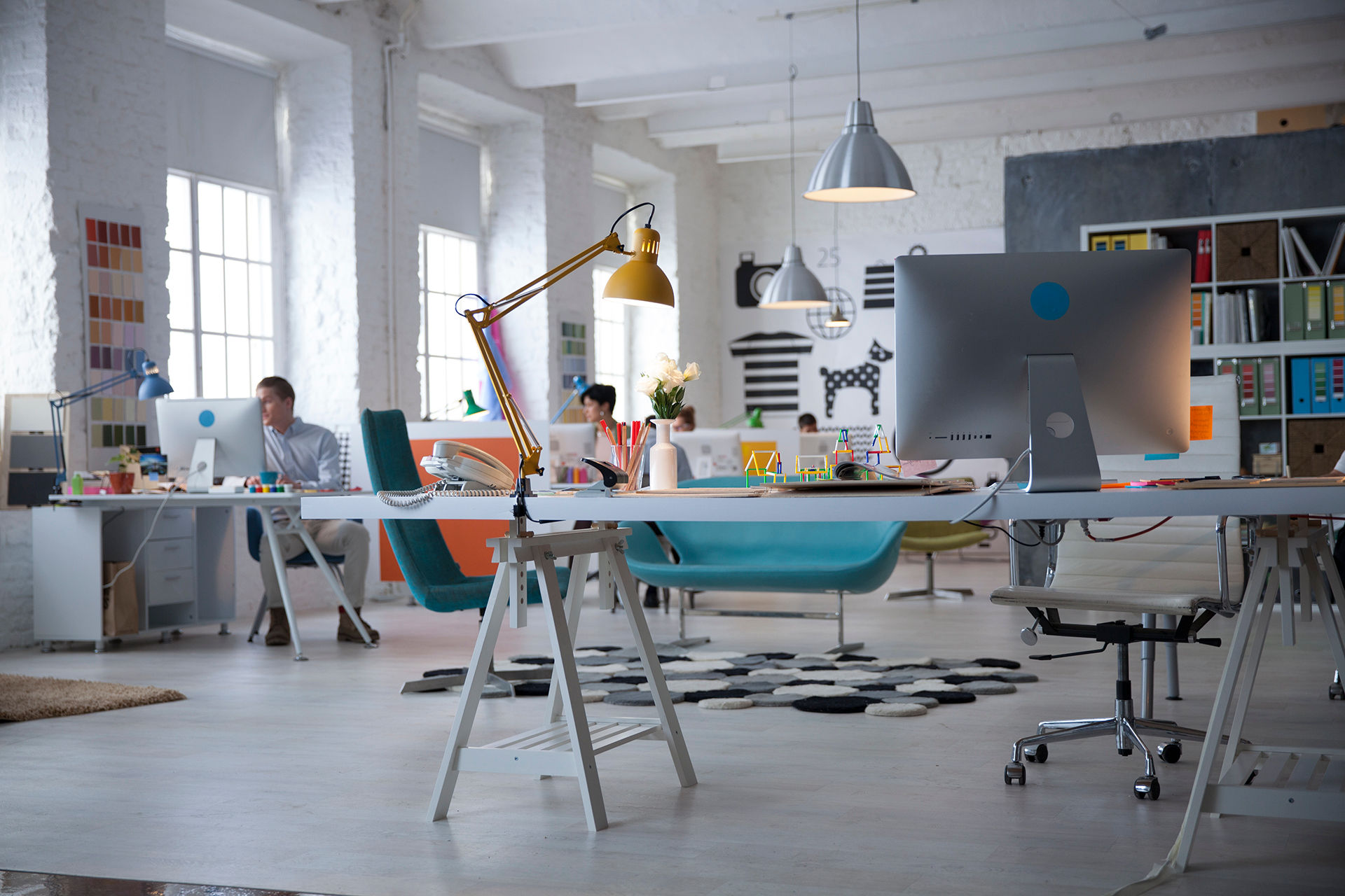
Purpose: The purpose of this website 'Boomsatsuma education' is to sell their service for people who are interested in Media or Acting.
Content: The content that is on this website is very clear. Examples: -Navigation bar, this is useful for finding out different information about Boomsatsuma as a company. - About Us link, telling the visitor who they are. - News page, another source of information about the latest events within Boomsatsuma. -Photos, showing the visitor what is takes place within the media and acting courses. -Buttons, Sign up, this is where visitors can click to find out more about the courses given.
Features: The features that Boomsatsuma have on their website is a gallery that holds imagery within the 'Acting Diploma', videos in the main bar of various different events that have happened that Boomsatsuma have got involved in or hosted, a scroller at the bottom of the main bar that the visitors can go through to see what's available and buttons, hyperlinks. Having an interactive feature, will attract a bigger audience towards Boomsatsuma.
Visitor needs: Visitors will be able to know this through information about Media or Acting on 'Boomsatsuma's' website through 'Apply here' allowing them to apply for the course they'd like to, contact communication from the admin of the web to find out more about the company or about the course they are applying to.
Information Flow: For the content on this website and to help with information flow for the visitor, they would use the navigation bar at the top of the page to find the 'About Us' page. Here they'd find out more information about who Boomsatsuma are as a company, their story, who the staff are, where they are based through Bristol and their social media platforms.
From the visitors perspective, knowing more about 'Boomsatsuma' gives them a bit more confidence on what they'll be getting into and who they'll be working with. It also gives the staff within Boomsatsuma more relief that they've got trust from their next potential pupil(s).
In terms of layout, Boomsatsumas' website scrolls down horizontally meaning it scrolls down in a straight line which makes it easier to view content.
Benefits: The benefits of buttons, hyperlinks on their websites is that it will draw in a bigger audience for the courses being advertised and it also, spread the information to people who are interested and who may be interested later on.
Having a navigation bar at the top of the website is beneficial to the company and visitors, as it's very clear and easy to find what you are looking for.
Colour schemes used; white on black and black on white, being dull colours can be beneficial because, a visitor looking at this web page may be colour blind and it will make it easier for them to read the information.
analysis 2.
Purpose: The purpose of 'New Looks' website is for commercial in terms of selling and promotion of their clothing brand.
Content: The content on this page is very clear to the eye. Examples- Tool bar at the top of the page showing the visitor where to go to find what category they want. -Search bar, to search for specific items down to detail they are want to look for. -Photos of items of clothing on models and of seasonal attire. -Buttons, sign up, this is where visitors can go to be notified when something new comes in or the latest newspaper.
Features: The features that New look have on their website are photos of models they've used to present their clothing as a brand, shoes footwear and accessories, showing what they are promoting.
Buttons are used on this website along with hyperlinks.
Having an interactive system will bring in a bigger audience of buyers, as they will be able to see what there is.
Visitor Needs: Visitors looking on New Looks' website will be able to benefit from the promotion of their clothing, footwear and accessories by being able to purchase the product they are wanting to get.
Information Flow: For the content that is on this website and will help with information flow to the visitors, they would use the toolbar at the top of the page to find the 'category' that they want to look at.
Here they'd find options of different clothing within the categories.
Benefits: The benefits of having buttons/hyperlinks on their website will bring in a wider audience for purchasing the company as a brand.
Having a search bar and a toolbar is beneficial to the company, as it's helping them bring in more visitors for the product and beneficial for the visitors, as they know where to go if they are looking for something.
P2- PLan for my new website.
Introduction:
From researching and analysing 2 websites that are completely different from each other, I have decided to construct a portfolio website where I can place together all my work that I will create during my time with Boomsatsuma.
Purpose: The purpose for my website will be a portfolio of all the work that I will create over the two years of being with Boomsatsuma. I want somewhere that I'm able to show off my work that I will be proud and somewhere that a potential employer can see what I'm capable of.
Target audience: My target audience for my website will be Examiners, who will assess my work, Teachers within my course will assess my work, give me feedback that will help me improve my work to make it better, potential employers and other creatives.
Audience profile: Reece Morrell, White male, 27 years old, Teacher within Boomsatsuma. Monthly spending power £750-£800. Hobbies/Interests: Media, Film, Music, TV, Sports and Gaming.
Content: The content that will exist on my website will be a 'navigation bar' that will be at the top of the page that will have all the titles of Units that I will do and place upon individual pages. This will be easy for examiners and other creatures through media to find and assess my work.
Each page will have text on it within the various units that will be completed throughout my time at Boomsatsuma. Potential video links if a unit includes the need for a video. Buttons that will take the assessor to and from final pieces of work that I will complete.

I have put together a Production Schedule of the tasks that I will do prior to creating my website. This is what I am to complete before creating my Wix.
Home page layout:
Site map:

Here is a map of how my site is going to look when I create it. At the top will be home, coming off that will be; unit work, Everyday people(a short documentary), Raising Aspirations, Portfolio(all my final work), a blog and photography.

Above is an anticipated structure of my home page on my Wix website.
With colour schemes, I will keep it simple with black on white. Backgrounds, depending on the units, I will change them to fit the setting.
Suitability :
- I feel my website is suitable for my visitors because, it's easily navigationally in terms of having a bar at the top where all my completed work would be placed as I'm going along and completing it.
There isn't a 'back' button to get to the 'home' page, but if the visitor clicks on the 'home' page it will go to the start of my website.
Colours don't clash together, text and fonts are legible and understandable.
Legal and Ethical Considerations:
When creating my website, I need to consider legal and ethical issues that may occur. First and most important legal issue to consider is copywriting: 'Copyright is a form of intellectual property'. I need to make sure all content I say or use when creating my Wix is that it's copyright free and owned by me. So, images, videos and text, but if was to use content that wasn't owned by me and another creator, I would have to get appropriate permission before using.
Another thing to consider is personal data, this is given through a contact box that I will place at the bottom of my home page where visitors viewing my page can leave feedback or ask a question about my website.
When I receive personal data, I will keep it to myself and not be malicious to give out. This is covered by the data protection act 1998.
Ethical issues are another main consideration in terms of inappropriate language, inappropriate imagery and inappropriate content that isn't going to offend a certain group of people or would cause defamation of an individual. This would include an use of religious themes that were interpreted in a wrong way.
To avoid any offence to anyone, I will not use any offence language, imagery or any inappropriate content that way I will not cause defamation to a group or individual.
Budget:
My budget on my website all together would be £85 because, that's how much it would cost to run and be a domain holder annually. I won't need to spend anything else on my website to create because, I can create freely by hand and type freely too.
The only money I will spend is being a domain holder and the time I spend creating my website, but I already have a plan about how I am going to do that.
Potential Revenue:
With my website, I could make money by placing adverts on it using an advertising platform such as Google Adsense as I feel my website captives quality and imagery. Having https within my pages will take a one stream revenue that will come out of my Google Account. I could also start up creating and selling products that I can start making for visitors to buy.
P3- create.


Above is screenshots of page content I mentioned in P2. My home page, the first thing the visitor will look at, about me, a paragraph getting to know me better and a contact box, to contact me if the visitor would like to know more.

home page:


The 2 screenshots above are what my website would look like on a desktop and mobile form.
p4-feedback.


After creating my Wix website, I decided to gather feedback from 4 students within my course to write back to me through my contact box.
All pieces of feedback include:
-Navigation; how easy it is to navigate.
-Hyperlinks.
-Quick load on pages.
-Google Chrome and Internet Explorer.
-Colours and Fonts. Consistent?
p5- evaluating feedback.
After looking through my feedback from my fellow pupils within Boomsatsuma, I didn't realise how positive my website was.
I agree with my feedback that I received from the 4 who were kind enough to take out sometime to write how they felt my website stands. Most of them mentioned about navigation, having a navigation bar at the top and how easy it was finding all my work without being confused about where to look. The content: hyperlinks, photos, backgrounds and fonts were also easy to access and that on each page hyperlinks and photos loaded quickly without a delay between scrolling.
Text was legible and easy to read. I kept the same fonts and size of text throughout all my pages because, 1. Consistency and 2. Because I am very fussy when it comes to things being the same, a bit OCD.
The Aesthetic quality, I feel my website looks very nice and went the way I wanted it to go through many moments when it didn't go right. Background after background on the pages and finally picked the ones I wanted. Each page with a theme from the Units given, e.g. Unit 35 is a social media based Unit so the background has a social media flow to it.
The content that I have included on my website, I feel fits the intended purpose I said that I wanted when planning for the final creation. It shows off my work that I have put my all into and it will hopefully impress potential clients I may work with after my time at Boomsatsuma.
At the top of my 'home' page 2 units are by themselves, 'Everyday People' and 'Raising Aspirations' this is because, coming off them are sections and with that there isn't enough room to fit them both into my Unit work folder. They are too big with having extra sides on them.
To improve this I could create a separate folder for 'Extra Unit work'.
I received feedback about my animated background and that it was quite distracting so I decided to change it to a still background so my visitors won't be focused on that and they'd be more focused on my work more than anything.